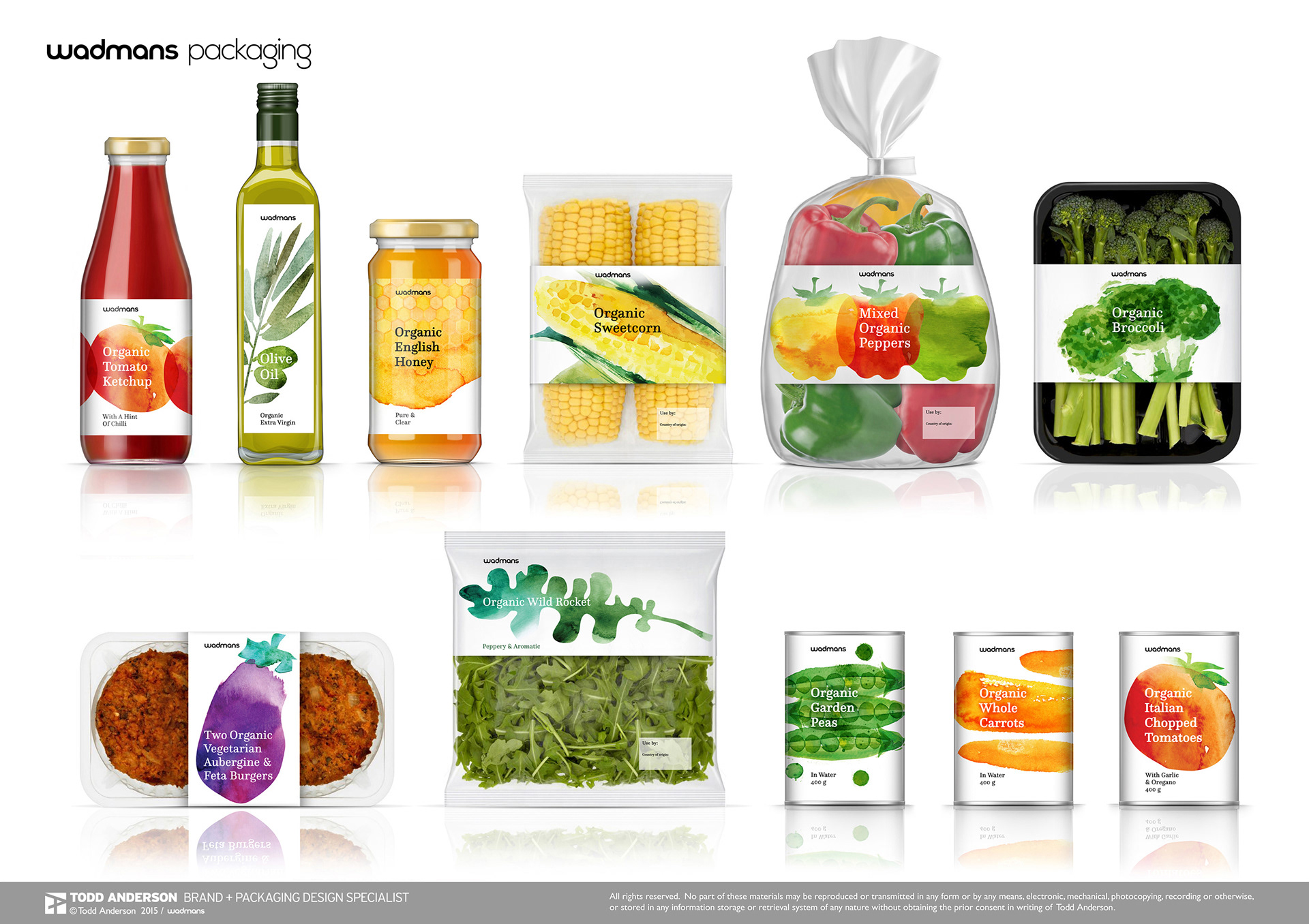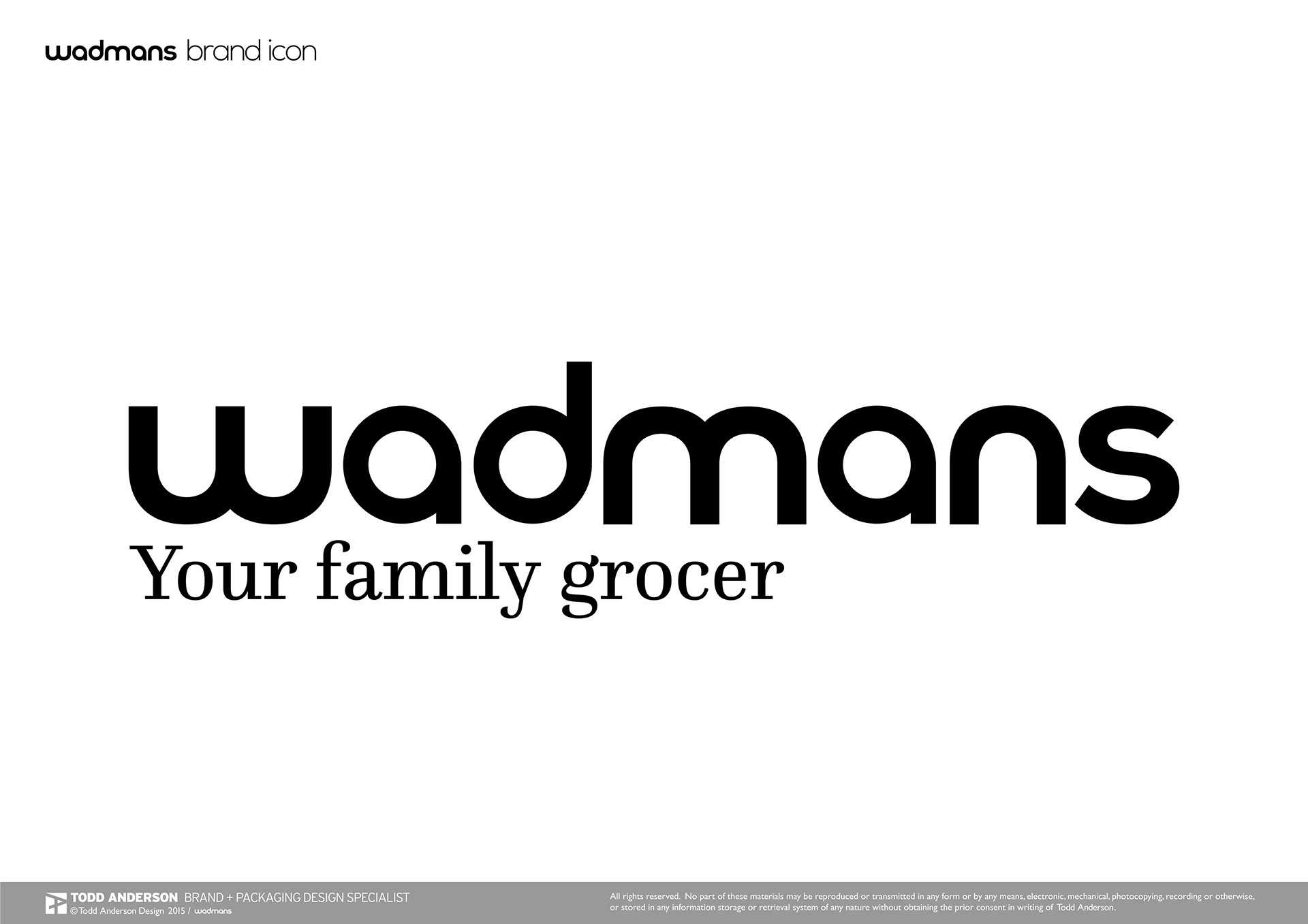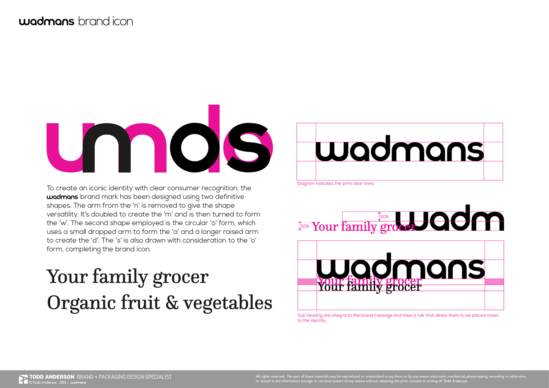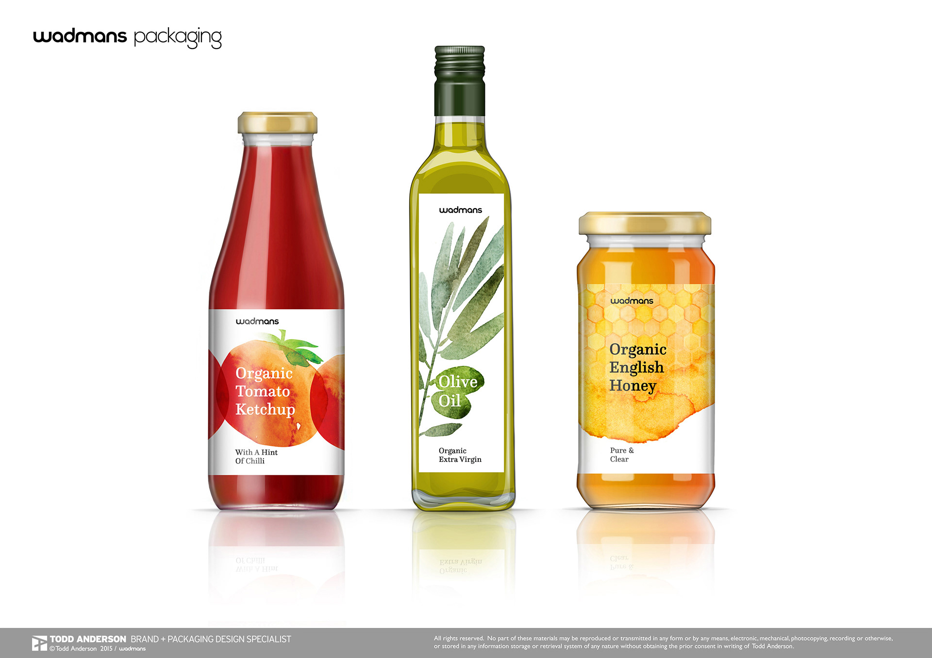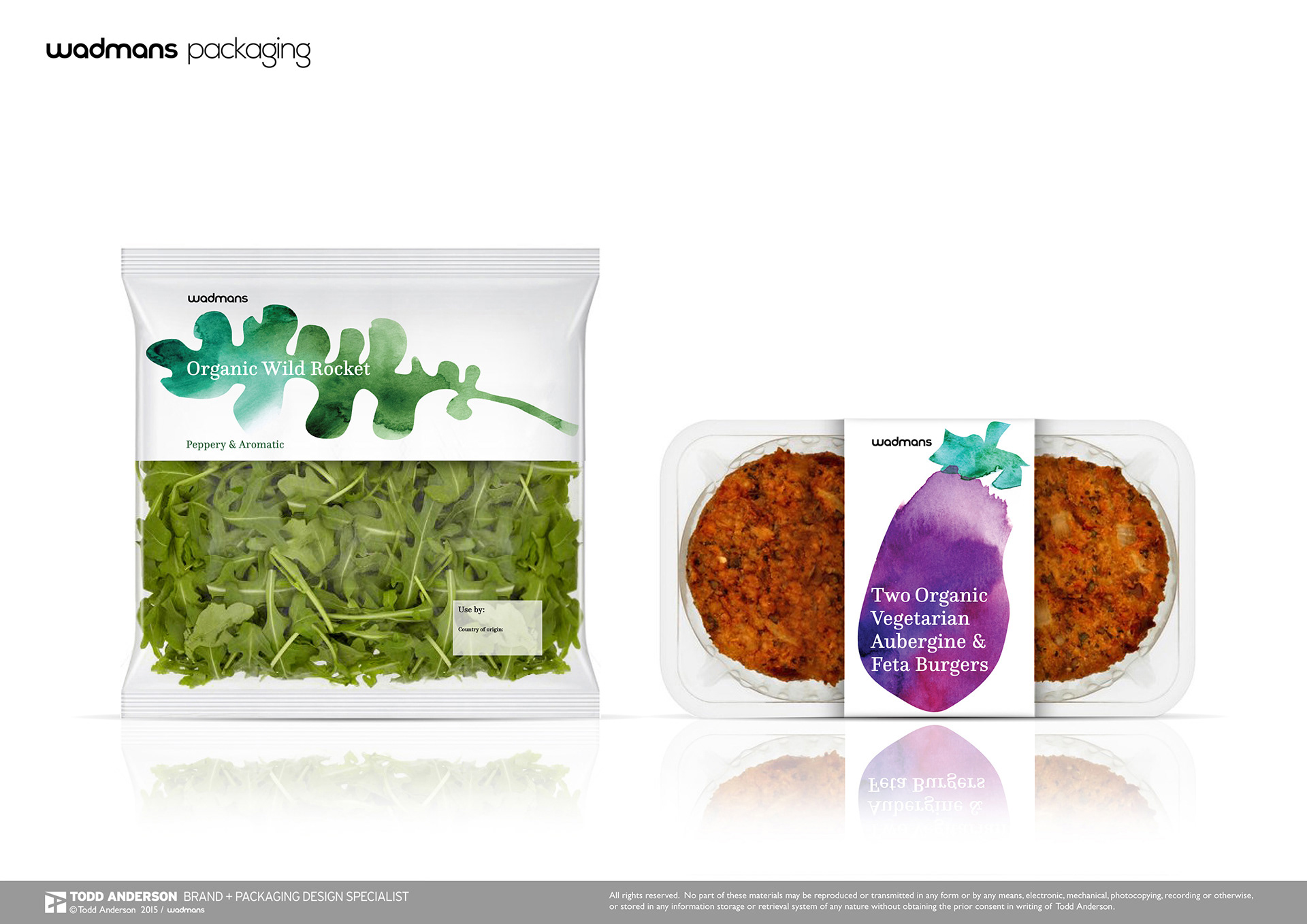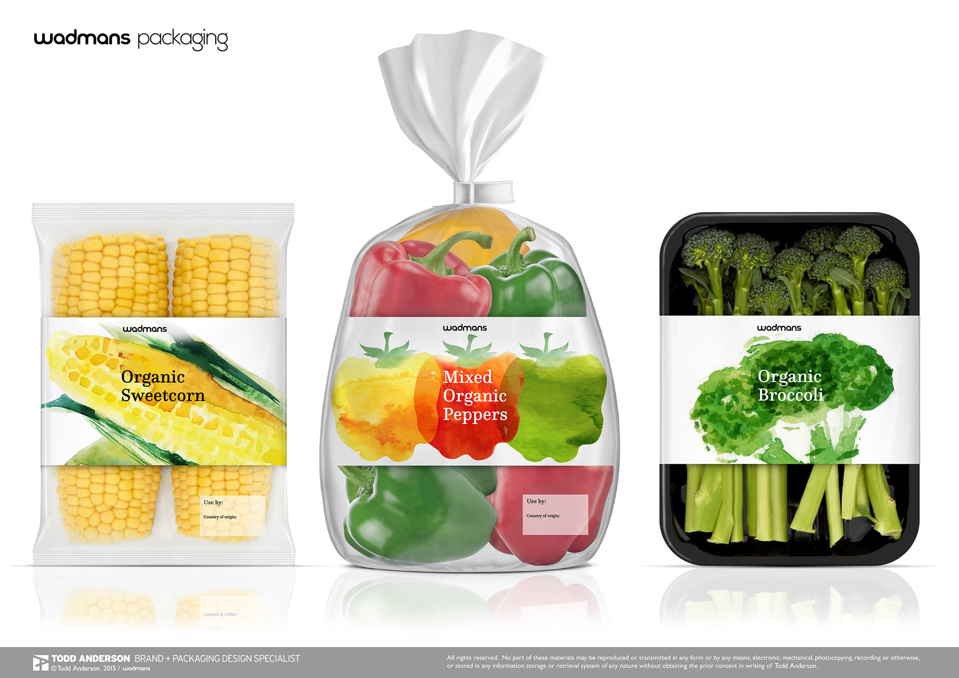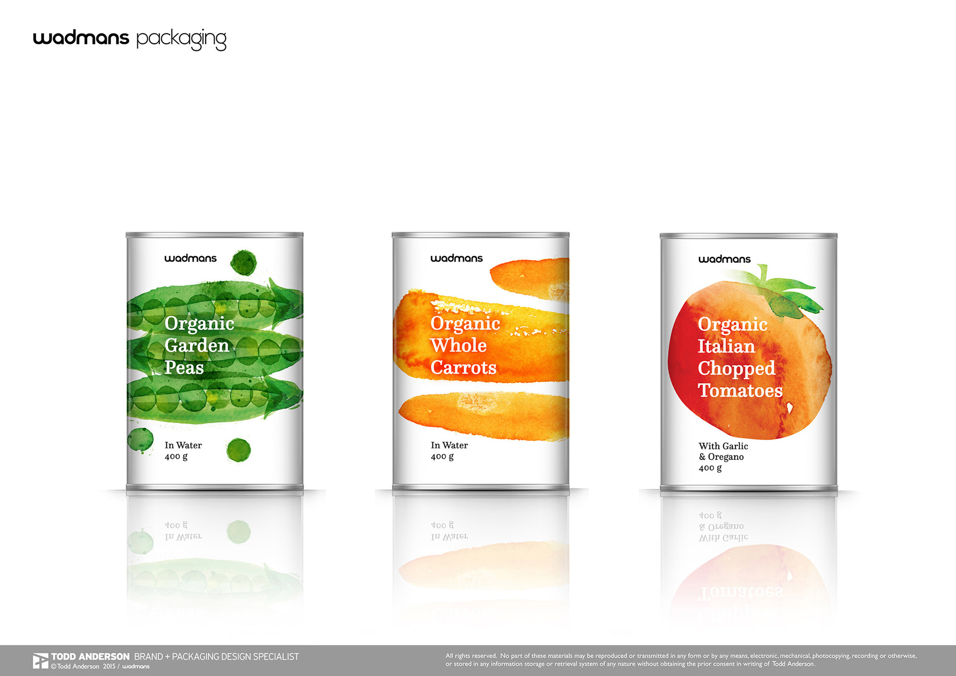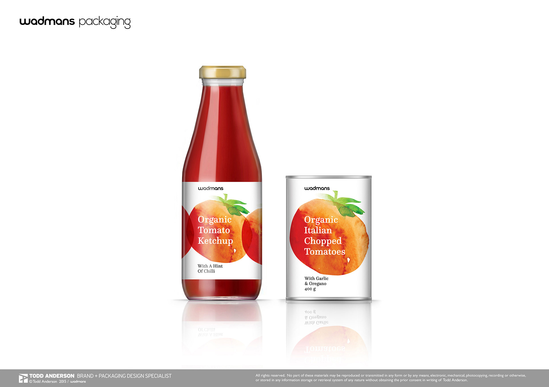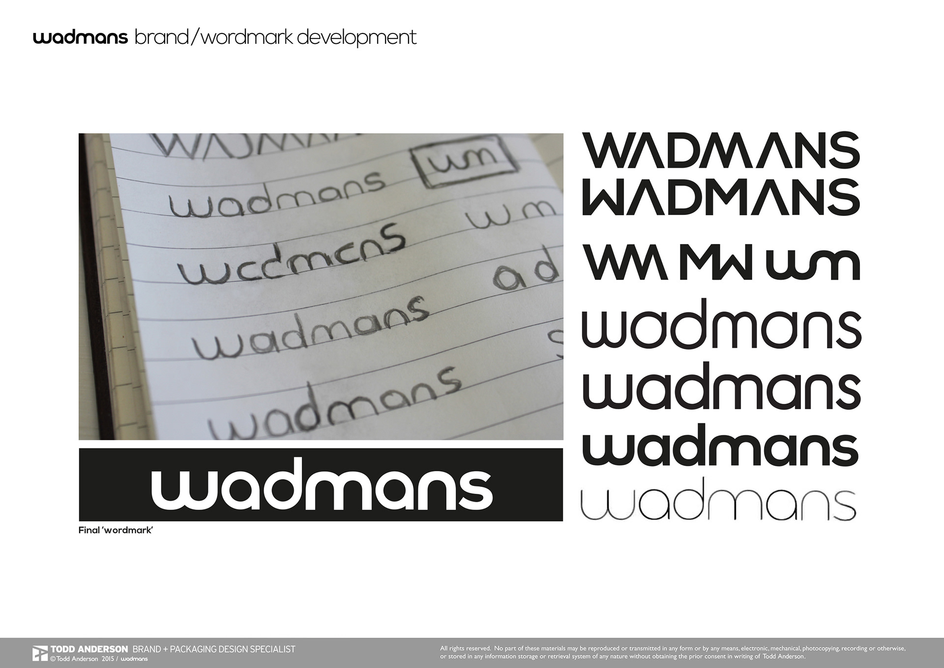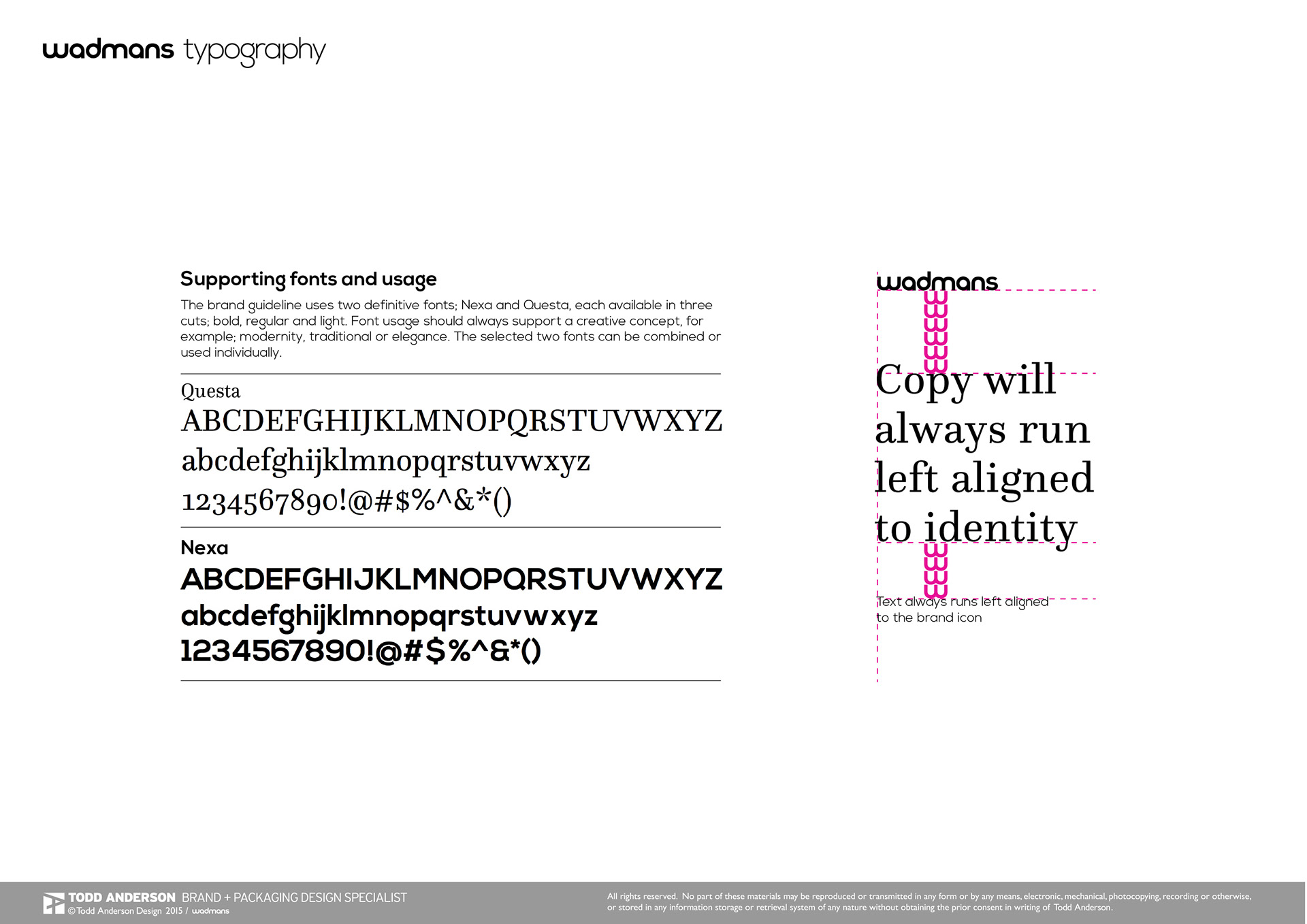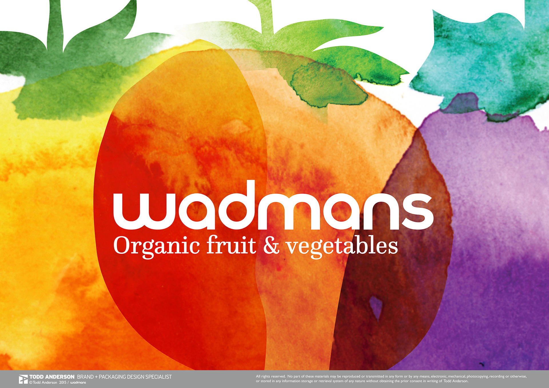

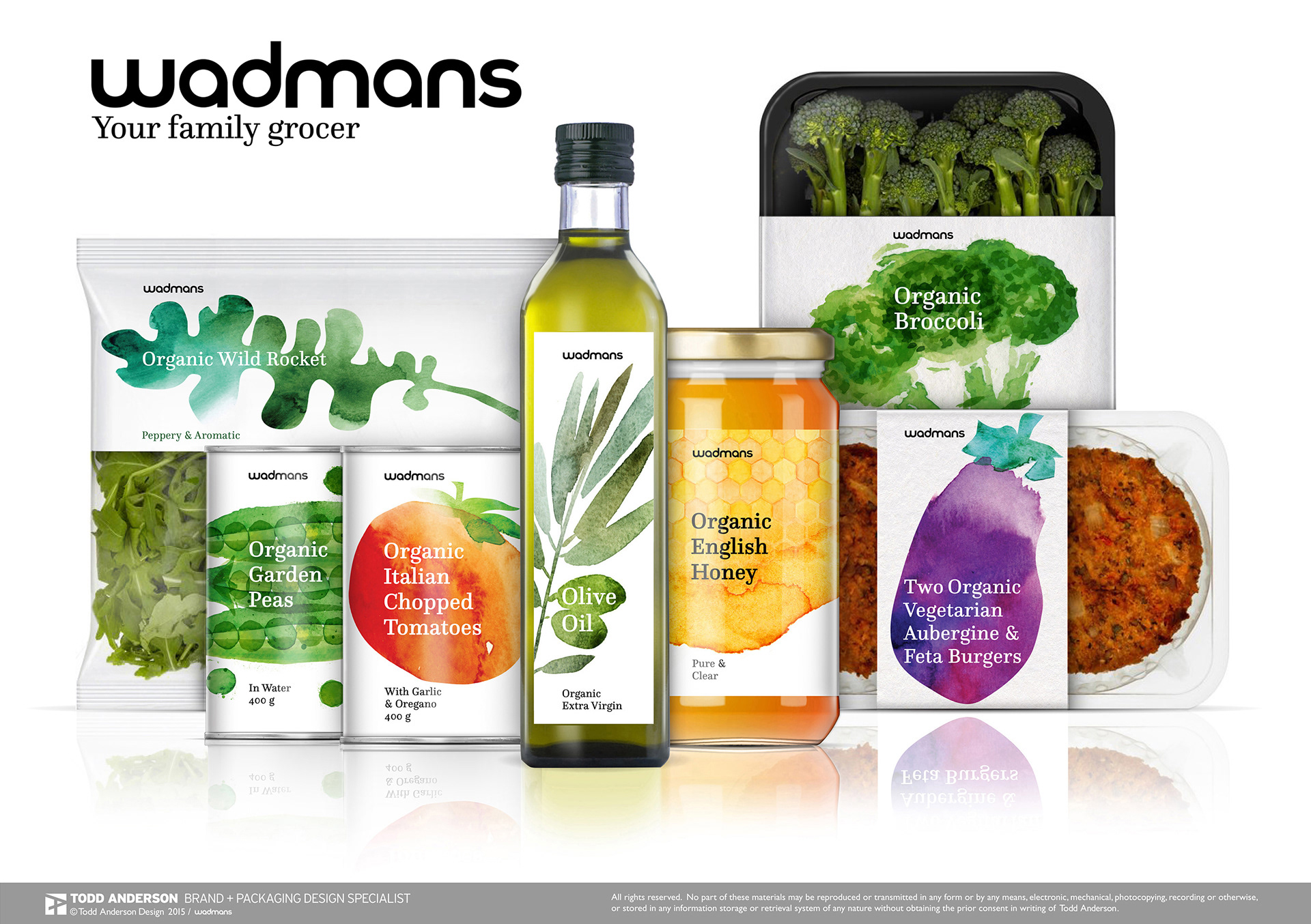
Inspired to challenge the common format of supermarket packaging design, pleasant watercolour illustrations of the principle ingredient were selected to take the usual place of a photograph or plain label. A white background provides a cleanliness and adds breathing space when the products are positioned consecutively. The ‘Wadmans’ name brand was selected for how the characters within the word could be abstracted to form interesting and memorable shapes, and be kept minimalistic in its design so to allow focus on the quality of product.